branding // web design
2022 ~ 2023

Client
50+1 strategies is a political consulting firm based in San Francisco known for building local campaigns and grassroots movements surrounding progressive advocacy work.
Ask
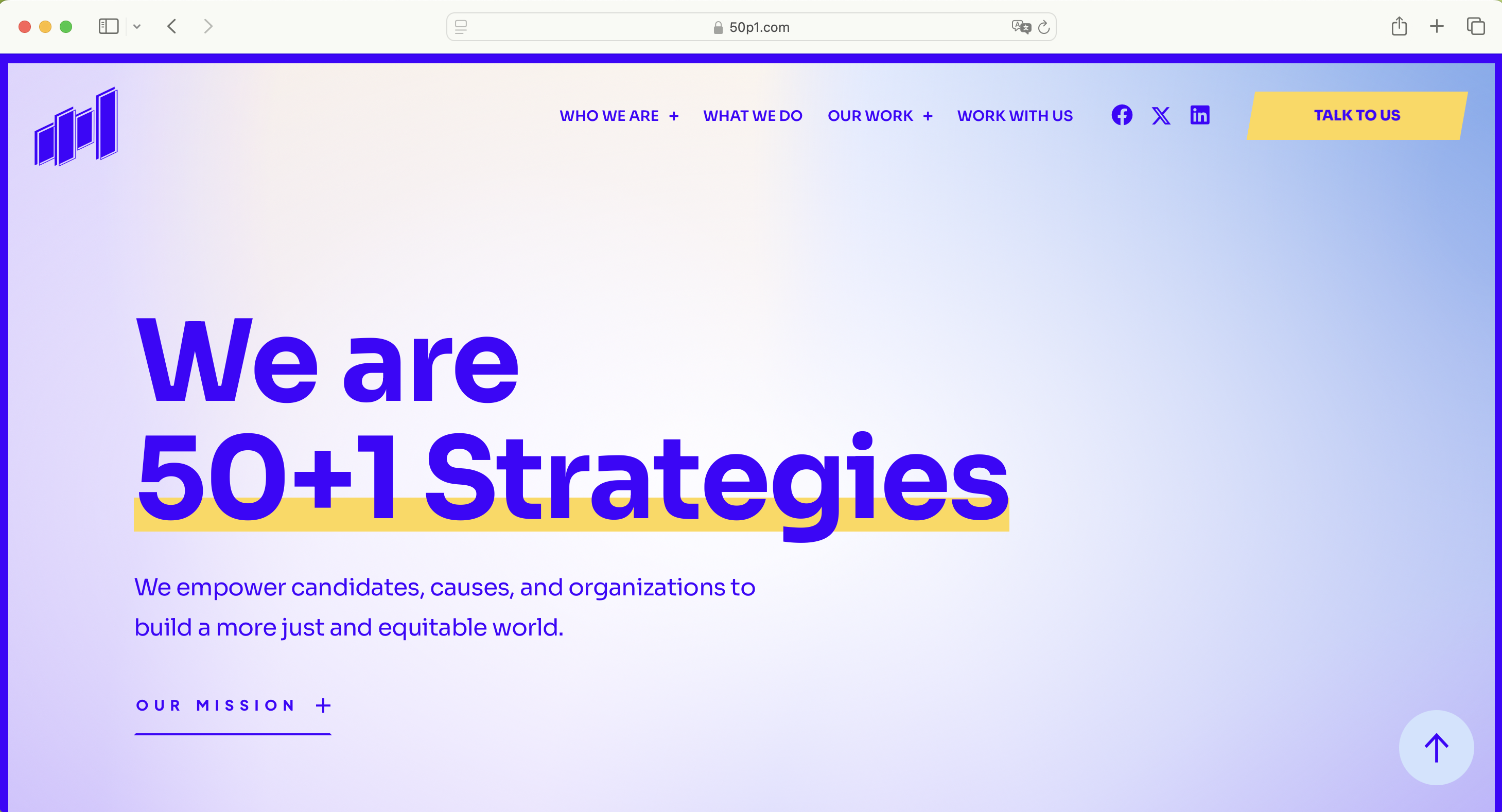
Celebrating 11 years since its launch, 50+1 Strategies wanted a new branding identity that mirrors a vibrant growth in their work and mission.
Timeline
Role
Team
Sept 2022 ~ Oct 2023
[13 months]
sept~nov — research
dec — sketches
jan~mar — design
april — logo launch
may~sept — website design
oct — website launch
lead designer, creative strategist,
art director
- research & strategy
- logo concept & design
- website mockup & art direction
- project management
Giancarlo Lobo, marketing
Candice Dayoan, design strategy
Jenn Edwards, marketing
Deborah Camiel, copy
Matt Herdman, copy
Ben Childs, web design
Research/Strategy
Starting with the initial brand research, we dissected the firm’s title and their old logo: an emphasis on the numbers (50, 1), signifying a tipping point towards the majority, and the plus sign as their joining motif. When conducting thought exercises such as “how would you describe the direction of the firm in three words?” or “what feeling do you want to share with people?”, there was a general consensus on creating a dynamic, lasting movement for and towards change.
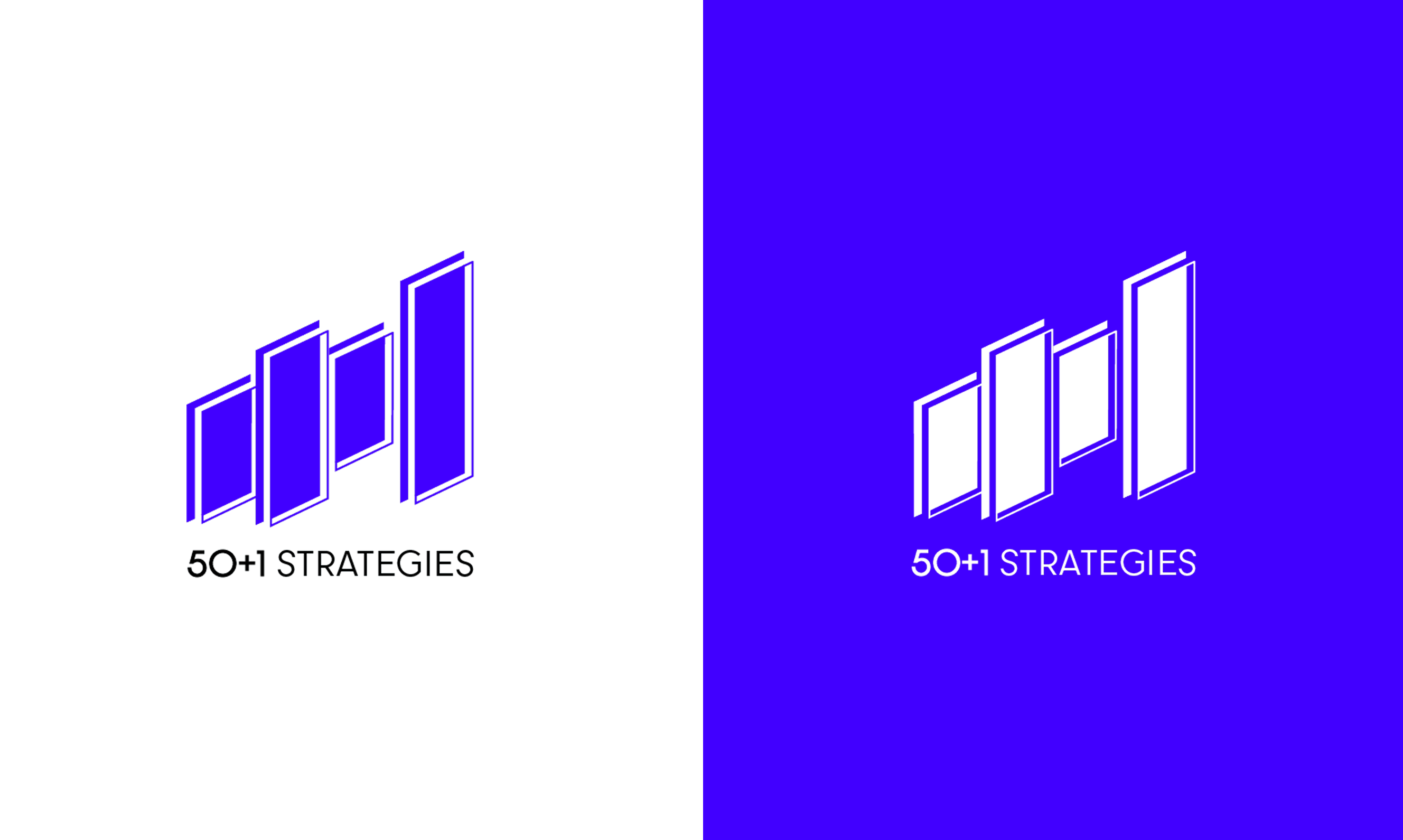
Logo
Drawing inspiration from dynamic and flexible logos, we wanted a versatile branding
identity that could serve multiple issues and partnerships in public and private sectors.
We were drawn to the plus sign as the main motif and produced multiple iterations of the symbol.
Some feelings we wanted to evoke were:
- Open opportunity
- The future/“the other side”
- Hope and change
- Active movement, a push

Result
We arrived at a logo that considers the balance of youthful power,
dynamism, and strength. The layered plus sign stays as an open-ended visual interpretation
that alludes to windows or doors/portals to the other side.
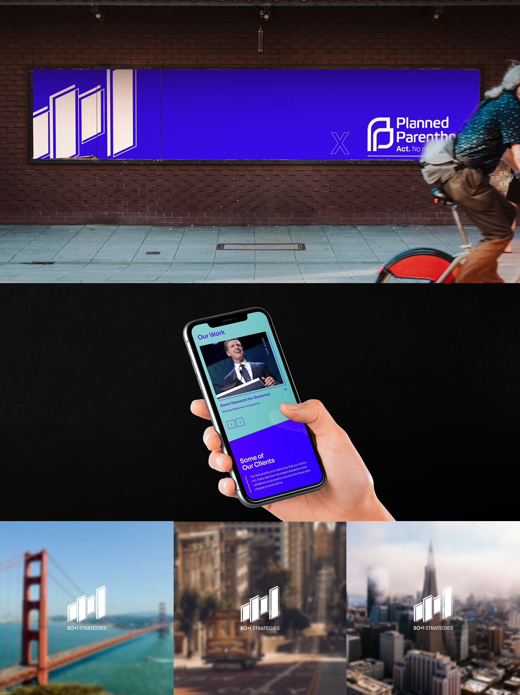
50+1 Strategies website was designed by Apollo Artistry